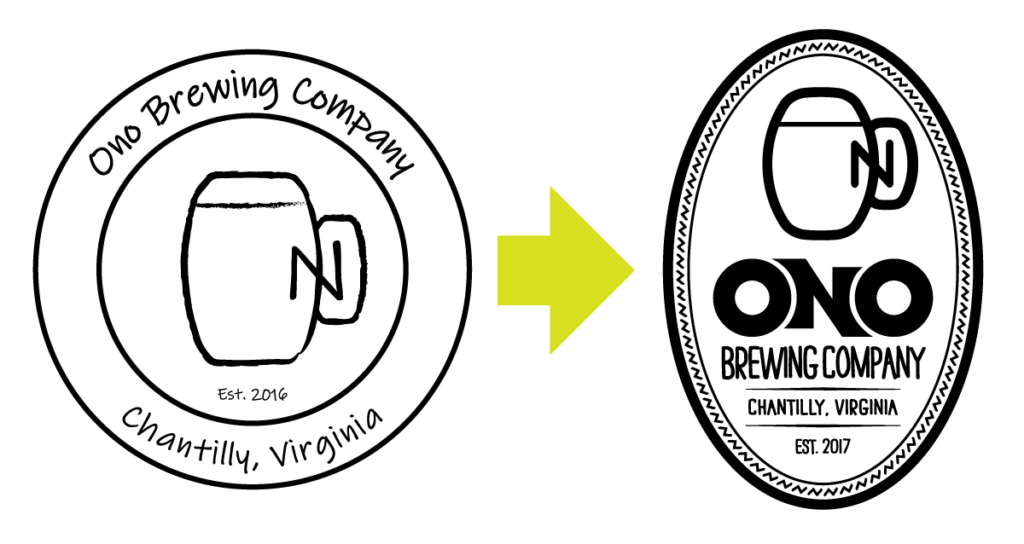
A local brewery asked me to give their existing logo a bit of a refresh. The company had a lot of money invested in their old logo which appears on their glassware, signage, shirts, and a number of other places, so they didn’t want to completely abandon, but preferred to come up with something “similar but different.”

Ono Brewing Company is a Hawaiian-themed brewery, but their old logo didn’t really give off that vibe, so I wanted to make sure to bring in a bit of the tropics to the new logo. The first thing I did was updated the presentation of the name to be much bolder in appearance, and styled the word after a tribal Polynesian tattoo. The mug icon was the main element of the previous logo, so it had to stay, but I cleaned it up and thickened the lines to give it some more weight. I made the “container” in the shape of a skim board with a simple tropical border, and now the brewery has a logo that stands out.

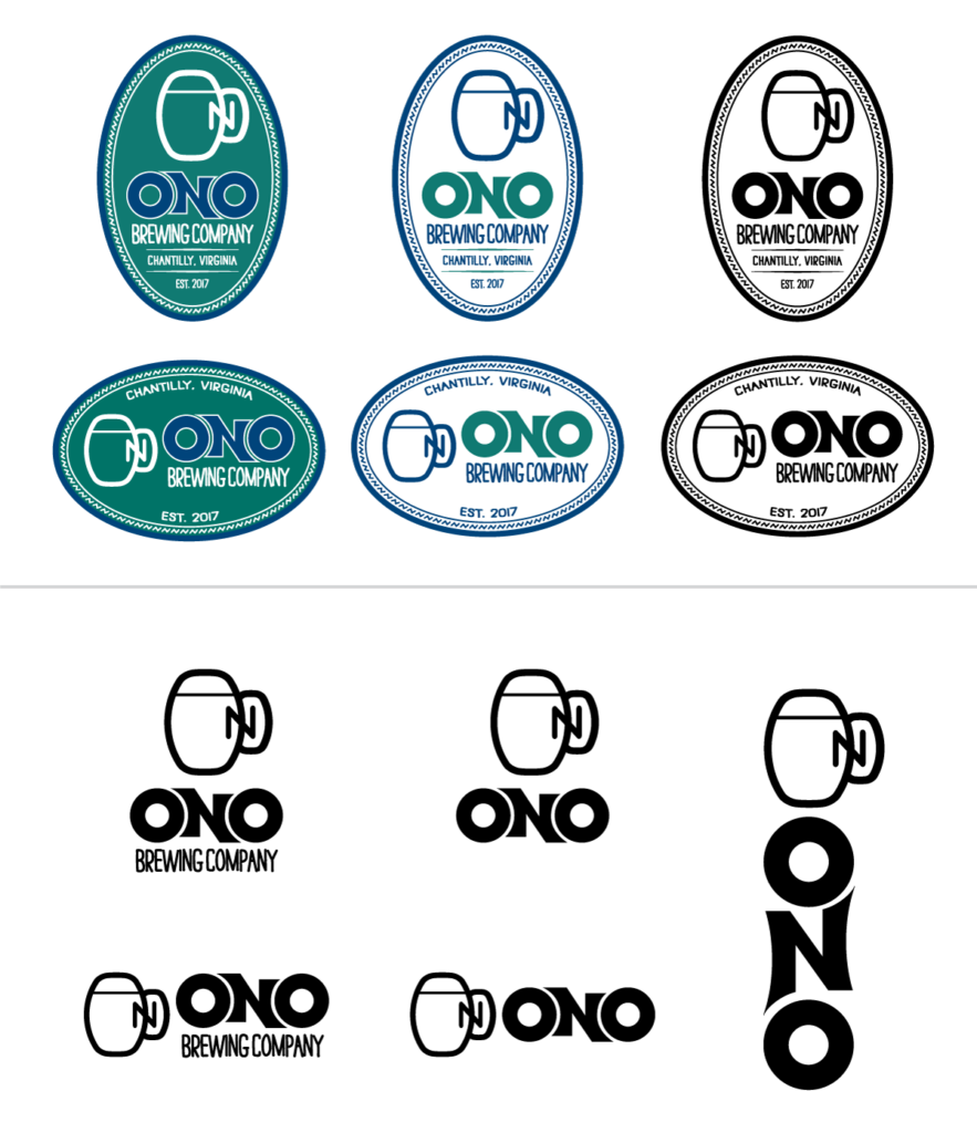
Once the logo was finalized, I created full-color versions, along with other versions that would be useful for a wide variety of promotional items ranging from glassware, clothing, tap handles, and more.
Designing an update to an existing logo can be a much more difficult challenge than starting from nothing, but this one was ton of fun, and I think it turned out pretty great. Mahalo!
